
Inclusivity & Diversity in Packaging Design: Why Accessible Packaging Is Good for Business

Accessible packaging design is the practice of building pack structures, closures, and labelling that work for the widest possible range of physical, sensory, and cognitive abilities, rather than defaulting to a single average user. It covers one-handed openability, high-contrast and braille-inclusive labelling, and tactile cues that don't depend on sight or fine motor control. Brands treating it as a growth lever, not an accommodation, are seeing it show up directly in market share and repeat purchase.
Three in five people in the UK over 55 say opening packaging is a genuine source of stress. That's not a niche complaint from a hard-to-reach segment - it's the majority of an age group that controls a disproportionate share of household spending. If a pack fights back at the point of use, the brand pays for it in returns, one-star reviews, and quiet defection to whatever competitor's cap actually twists open.
Packforum 2024 put inclusivity and diversity squarely inside its "New Value" track, alongside blurred category boundaries and the refill economy - not as a corporate-responsibility add-on, but as one of four forces reshaping where packaging value actually comes from. The reasoning holds up: broader usability means a broader buying population, and that shows up on a P&L in a way that's easy to underestimate until you see the numbers.
Why Inclusive Packaging Is a Growth Lever, Not a Checkbox
The scale of who actually needs accessible design is larger than most packaging teams assume. Brett Domoy, Head of Packaging & Process Engineering at Unilever's Skin Cleansing division, laid out the numbers at Packforum in blunt terms: 700 million people worldwide are dyslexic, 2.2 billion are visually impaired, 773 million are illiterate, 300 million are colour-blind, and 1.5 billion have low reading skills. Add the elderly population managing age-related disability on top of that, and "inclusive design" stops being a niche consideration and starts looking like most of the addressable market.
| Condition | Global population affected |
|---|---|
| Visually impaired | 2.2 billion |
| Low reading skills | 1.5 billion |
| Some form of physical disability | 1 billion |
| Dyslexic | 700 million |
| Illiterate | 773 million |
| Colour-blind | 300 million |
Convenience compounds the effect even among people without a diagnosed impairment. Oral care brands already treat dispensing control as a competitive feature - a tube that releases the right amount, cleanly, on the first try, is quietly doing accessibility work for everyone, whether or not they'd describe it that way.
Designing for Impairments Isn't the Same as Designing for Inclusion
This is the distinction most packaging briefs miss, and it's worth sitting with before touching a single design variable. Domoy's example: a watch with numbers marked out in braille responds to blindness directly, but it's a narrow fix - fewer than 1% of blind people actually read braille. A watch built around a universal tactile system, on the other hand, works for that same population and for anyone else who can't easily read a dial: someone driving, someone in low light, someone who just doesn't want to stop and look.
The pattern: Designing for a specific impairment solves one problem for one group. Designing for inclusion solves an access problem that turns out to affect far more people than the original brief accounted for - and it usually costs less to build in from the start than to retrofit later.
What Inclusive Packaging Actually Looks Like Right Now
Three examples from the Packforum whitepaper show this playing out in production packaging today, not as a concept deck.
Kellogg: making the box itself the accessibility feature
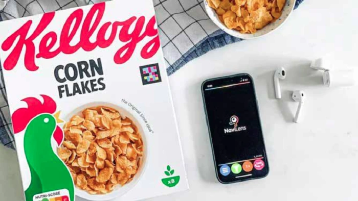
Kellogg Europe added NaviLens technology to its cereal boxes, letting a smartphone identify the pack from several metres away for blind and partially-sighted shoppers.
Kellogg Europe built world-first technology directly into its cereal packaging to make it identifiable to blind and partially-sighted shoppers using a standard phone camera. The shopper doesn't need a specialised device or an app built specifically for the disability - the accessibility layer sits on packaging already on the shelf.
Degree: rebuilding the format around one-handed use
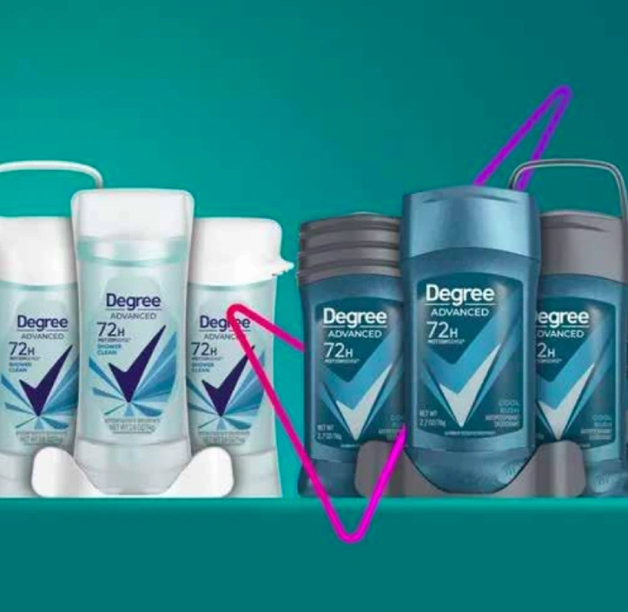
Degree Inclusive - the first adaptive deodorant designed for accessibility, with a hooked container, magnetic closure, and braille instructions.
'Degree Inclusive' is described in the whitepaper as the first adaptive deodorant built specifically for accessibility: a hooked container for one-handed use, improved grip, magnetic closures, a larger roll-on applicator, and braille instructions. None of that reads as a compromise on the product itself - it's a structural redesign that happens to work better for a much wider range of hands.
Olay: accessibility inside a premium beauty format
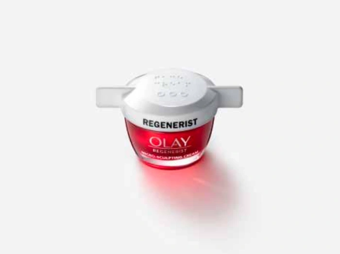
P&G's Olay Regenerist features an easy-open winged cap, an extra-grip raised lid, high-contrast labelling, and braille text reading 'face cream'.
P&G's Olay Regenerist line carries an easy-open winged cap, an extra-grip raised lid, a high-contrast product label, and braille text that simply reads "face cream." It's a useful reminder that accessible design doesn't have to announce itself or compromise a premium shelf presence - the winged cap looks like a design choice before it reads as an access feature, which is arguably the point.
Four Design Factors That Actually Determine Inclusivity
Domoy's framework breaks the practical work into four levers packaging teams can act on directly, rather than treating "inclusive design" as a single undifferentiated goal.
| Design factor | What it controls |
|---|---|
| Colour as a differentiator | Helps users navigate a product range quickly - but used carelessly, colour choices can send the wrong signal entirely. |
| Imagery and iconography | Reduces reliance on text, and travels across languages and cultures better than copy alone. |
| Typeface and language | Readability and contrast decide whether instructions are usable at all, not just whether they look clean. |
| Packaging shape | Waisted profiles, finger indents, and pump mechanisms change who can actually hold, squeeze, or open the pack. |
None of these four operate in isolation - a high-contrast label on a shape nobody can grip still fails the person it was designed for. The value comes from treating all four as one brief, not four separate checkboxes signed off by different teams at different stages.
Worth remembering: There is no perfect pack. Domoy's own framing is that striving for inclusive design, consistently, produces better and more usable products across the board - not that any single design ever solves accessibility completely.
What This Means for Packaging Teams Building Their Next Brief
The organisations already ahead on this - Kellogg, Unilever, P&G - aren't treating inclusive design as a separate workstream bolted onto an existing pack late in development. It's showing up in the brief from day one, alongside cost, shelf appeal, and regulatory compliance, as one more requirement the format has to satisfy rather than a feature added afterward.
For brands earlier in that process, the practical starting point is smaller than it looks: pick one format already scheduled for a refresh, and run it through the four-factor lens above before finalising the design. The Degree and Olay examples both point to the same lesson - meaningful accessibility gains often come from adjusting an existing structure (a cap, a grip, a closure mechanism) rather than rebuilding the format from scratch.
This is also where packaging innovation and engineering work earns its keep: translating an inclusivity requirement into a specific tooling change, material choice, or closure mechanism that survives contact with a production line and a cost target at the same time.
Frequently Asked Questions
What is accessible packaging design?
Accessible packaging design builds pack structures, closures, and labelling to work for people across a wide range of physical, sensory, and cognitive abilities - rather than assuming a single average user. It includes one-handed openability, high-contrast and braille-inclusive labelling, and tactile design cues.
Why does inclusive packaging matter commercially, not just ethically?
The population affected by some form of disability or impairment is far larger than most brands assume - 2.2 billion people are visually impaired globally, and 1.5 billion have low reading skills. Packaging that fails this group loses sales, not just goodwill.
What's the difference between designing for a specific impairment and designing for inclusion?
Designing for one impairment (like adding braille) solves a narrow problem for a small group - fewer than 1% of blind people read braille. Designing for inclusion, like a universal tactile system, tends to solve a broader access problem that benefits far more people, including many without a diagnosed impairment.
What are examples of inclusive packaging already on shelves?
Kellogg Europe added NaviLens smartphone-readable technology to cereal boxes for blind and partially-sighted shoppers. Degree Inclusive redesigned its deodorant container for one-handed use with magnetic closures and braille instructions. P&G's Olay Regenerist uses an easy-open winged cap with high-contrast, braille-inclusive labelling.


